.png)
Fondo is a digital platform designed to seamlessly blend investment management with community-driven exploration. The goal was to create an intuitive experience that enables users to track investments while discovering new places and projects in an engaging and interactive way.
As the Lead UX/UI Designer, I was responsible for user research, journey mapping, wireframing, prototyping, and final visual design. I collaborated closely with developers and product managers to ensure the interface was both aesthetically pleasing and highly functional.

Traditional investment platforms often prioritize complex financial data over user experience, making them difficult to navigate for everyday users. Meanwhile, social and community-driven apps focus on engagement but lack financial tools, leaving a gap in the market for a solution that seamlessly integrates both.
Fondo aims to bridge this gap by offering a platform where users can manage investments while exploring new places and projects through a vibrant community experience. The challenge was to ensure that both functionalities coexist harmoniously without overwhelming or confusing users.
Another key challenge was designing a visually appealing yet highly functional interface that encourages interaction and repeat usage. By leveraging user research and iterative design, we sought to create an intuitive system that simplifies financial management while enhancing community-driven discovery.
Our objectives were to design a user-friendly interface for investment tracking, incorporate features that encourage exploration and engagement, and establish a cohesive brand identity that reflects Fondo's modern and communal ethos.
Fondo is designed for modern investors who seek a seamless blend of financial management and community-driven exploration. Our target audience includes young professionals, digital nomads, and socially engaged investors who want an intuitive way to manage their investments while discovering new opportunities through trusted community insights. These users value a balance of financial empowerment, social connectivity, and user-friendly technology.
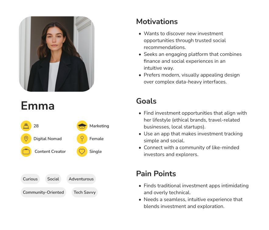
To understand the problem, we conducted user interviews and surveys to identify pain points in existing financial and community apps. Through this research, we identified two key user personas: Investor Ian, who prioritizes data and financial insights, and Explorer Emma, who values social-driven investing and discovery. These personas guided our design decisions to balance both functionalities effectively. We also analyzed competitor applications to determine best practices and areas for innovation.
Key insights from our research showed that users desired a simplified interface for managing investments without financial jargon. There was a strong interest in integrating social and exploratory features within financial apps. A minimalist design approach was essential for enhancing user engagement and reducing cognitive load.
We developed user personas to guide the design process. Investor Ian seeks straightforward investment tools with community insights, while Explorer Emma is interested in discovering new places and projects through a trusted community.

%201.png)
We began brainstorming solutions by developing concepts that merge financial tools with community-driven content. Mood boards inspired by Bauhaus principles guided the visual aesthetic.
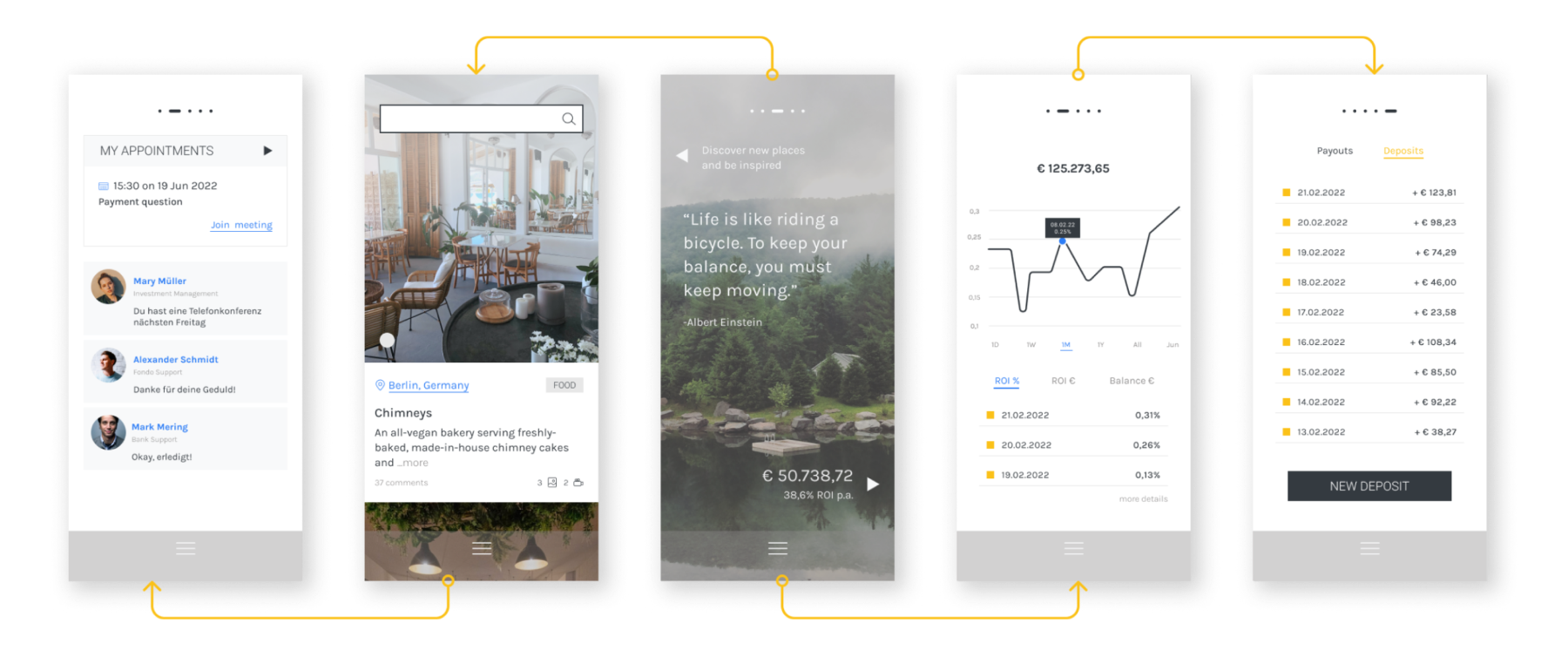
The low-fidelity wireframes focused on a dual-function interface. The right-side screens were dedicated to investment-related features, while the left-side screens showcased community exploration and inspiration.

For high-fidelity designs, we adopted a minimalist aesthetic with geometric shapes such as squares, circles, and triangles, replacing traditional icons to align with Bauhaus inspiration. A swipe navigation system was implemented between the six main screens to provide intuitive access to information.
The design system included a muted color palette with strategic use of primary colors for emphasis. Clean, sans-serif typography was chosen for readability and a modern appeal. Interaction design elements were incorporated, such as a daily-changing home screen photo that highlights new places, enhancing the exploratory experience.


Usability tests were conducted with a diverse group of users to assess navigation and feature accessibility. Based on feedback, we added visual cues, such as a balance amount with an arrow, to guide users toward investment-related screens. The main screen menu was enhanced for quicker and easier navigation.
The final deliverables included a fully designed and prototyped application ready for development, covering all screens and interaction details. The design successfully merges investment management with community exploration, offering users a unique and engaging experience. The minimalist and geometric design elements received positive feedback for their modern and clean appearance.


One of the biggest challenges was balancing the dual functionalities of investment and exploration without overwhelming the user. Careful planning and design iteration were crucial in achieving this balance.
Through this process, I learned that incorporating user feedback early and throughout the design process is essential for creating intuitive and user-friendly interfaces. In the future, I would explore additional features such as personalized recommendations based on user behavior to further enhance engagement.